Why So Many Control Rooms Were Seafoam Green
Now, looking at the interiors of the Manhattan Project control rooms and plants, the broad use of Light and Medium Green makes sense. One mistake and mass devastation could have occurred within these towns. Birren writes, “Note that most of the standards are soft in tone. This is deliberate and intended to establish a non-distracting environment. Green is a restful and natural-looking color for average factory interiors. Light Green with Medium Green is suggested.”
Fascinating information about something we don’t really think about (unless we’re trained to think about it). Hospitals are the same way. Here’s an example control room following Birren’s suggestions:
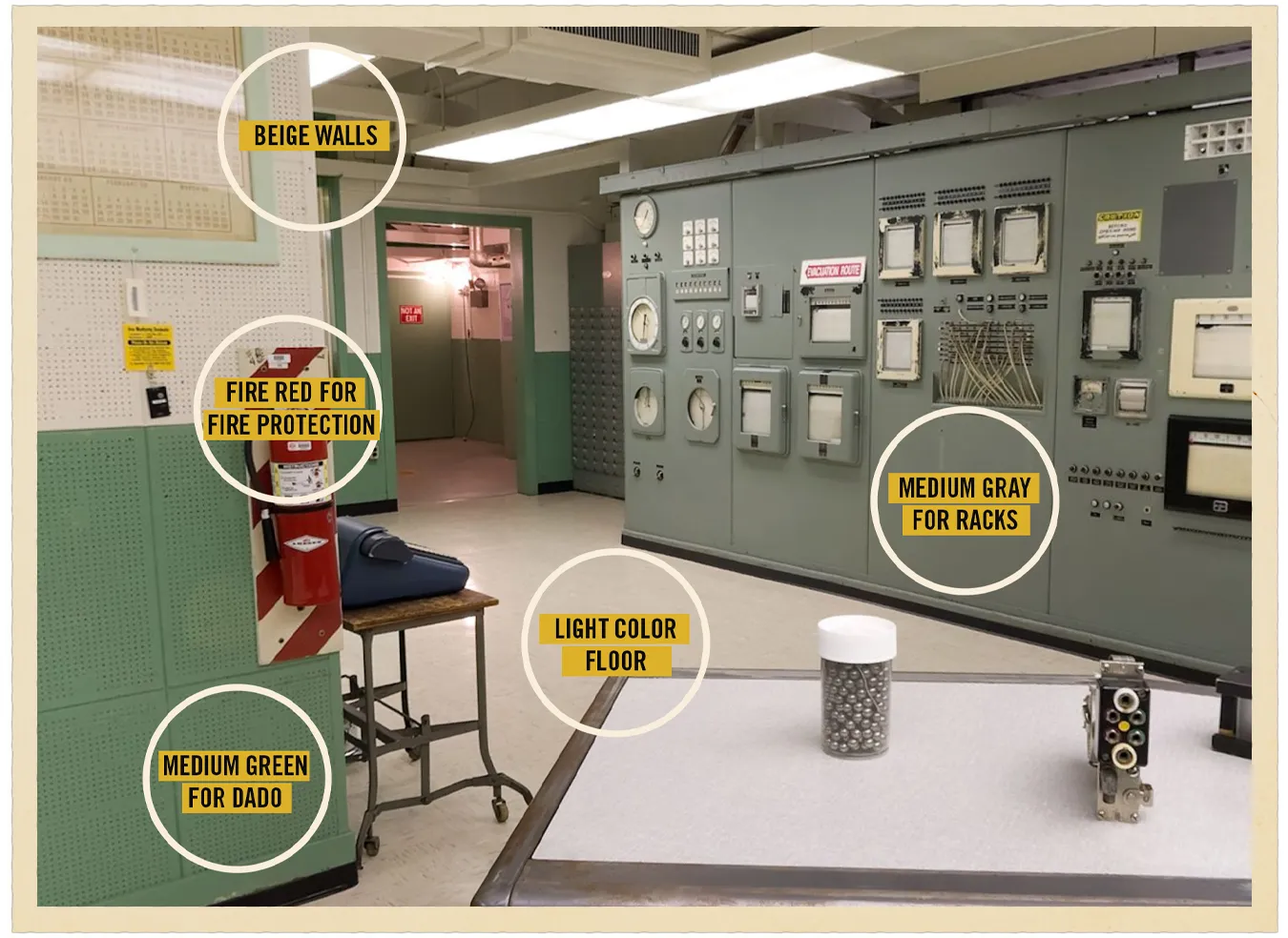
Looks normal to me. It probably looks normal to you. But it’s normal because of his influence. Well done, sir.